
Introduction
A Kajabi website can attract traffic and still produce very few inquiries, sign-ups, or sales. Often, the problem is not traffic at all. People reach the page, but the page makes the next decision harder than it should be.
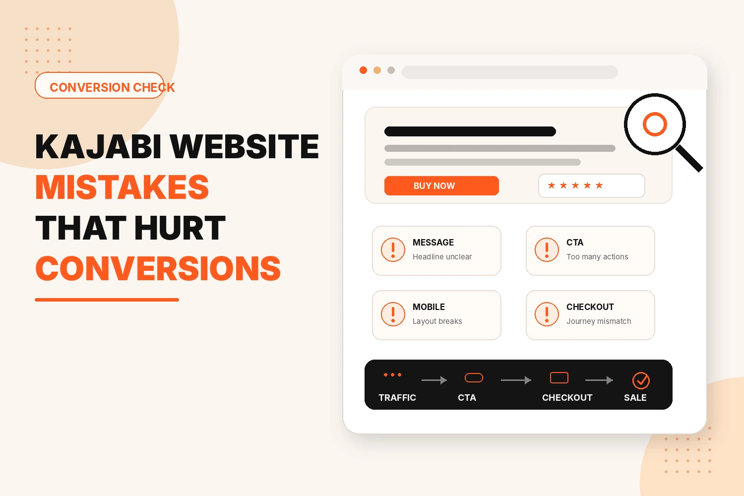
The most common Kajabi website mistakes usually sit between interest and action. The offer is unclear, several buttons compete for attention, useful proof appears too late, or the route to checkout feels inconsistent.
Common Kajabi Website Mistakes That Hurt Conversions
Discover the Kajabi website mistakes that drive visitors away and learn how to turn more clicks into customers.
Using an Unclear Above-the-Fold Message
The first screen should tell a new visitor where they are and why the page may be relevant.
A headline such as “Create the Life You Deserve” could describe coaching, a membership, or an online course. It sounds positive, but it leaves out the information a visitor actually needs.
A stronger opening should make these points easy to spot:
- What is being offered
- Who it is for
- The main outcome or problem
- What to do next
Giving Visitors Too Many Calls to Action
A page can contain several buttons without needing several goals.
Problems start when one button says “Book a Call,” another says “View Courses,” and a third promotes a free guide. The visitor now has to choose between unrelated actions before deciding whether the main offer is right for them.
Choose the primary CTA according to the page purpose:
- Lead-generation page: complete the form
- Course sales page: view the offer or checkout
- Coaching page: inquire or book the intended next step
Adding Too Much Content to the Page
Long pages are not automatically bad. The issue is whether every section helps the visitor to make a decision.
Someone considering a course or coaching program may need information about suitability, delivery, price, and common concerns. Repeated benefits add length without adding value.
Keep content that helps a visitor:
- Understand the offer
- Decide whether it fits
- Answer a real question
- Feel confident taking the next step
Making Navigation and Next Steps Confusing
Site structure often makes sense to the owner because they already know where everything lives. A first-time visitor does not. When menu labels are unclear, similar offers appear across different pages, or important sales pages are difficult to find, visitors may leave before taking action.
Make the journey simple by using clear navigation labels and guiding visitors toward the next relevant step.
- Use clear and familiar menu labels
- Keep related offers and information together
- Make important sales pages easy to find
- Use buttons that describe the next action
- Check that every link leads to the expected page
- Guide visitors from information pages to the relevant offer or checkout
Hiding or Using Weak Trust Signals
People usually want reassurance before submitting a form, booking a call, or paying. The mistake is often not a complete lack of testimonials or proof. It is putting that proof where it has little influence.
A specific testimonial beside an important offer can be more useful than several generic quotes near the footer. Useful trust signals may include:
- Relevant testimonials
- Genuine credentials or experience
- Clear information about what the buyer receives
- Straightforward pricing or payment details where appropriate
- Reassurance near forms or checkout
Misconfiguring Kajabi Forms, Buttons, or Redirects
A page can look correct and still lose conversions because the journey behind a button is wrong.
A form may be submitted but lead to an unhelpful page. A CTA may point to an outdated offer. A thank-you page may fail to explain what happens next.
Before publishing, test the whole route:
- Click every important CTA
- Submit forms with a test email
- Check the confirmation or destination
- Confirm the expected follow-up
- Follow the route to the correct offer or checkout
Ignoring Mobile Usability and Page Performance
Most editing happens on a large screen, which makes mobile problems easy to miss. On a phone, headings may wrap badly, images can dominate the screen, buttons may be awkward to tap, and a short desktop page can become an exhausting scroll.
Check important pages for:
- Readable text and sensible spacing
- Easy-to-tap buttons
- Usable forms
- Sensible image cropping
- A visible main CTA
- Media or page elements that make the page feel slow
Creating a Disconnect Between the Sales Page and Checkout
Checkout should feel like the next step in the same purchase, not a different offer. Hesitation can appear when the program name changes, the price looks unfamiliar, the payment option is unclear, or the sales page feels unrelated to checkout.
Compare both pages and check:
- The offer name is consistent
- The expected price is clear
- The CTA leads to the correct offer
- Payment choices make sense
- The buyer knows what happens after purchase
How Do You Check a Kajabi Website for Conversion Mistakes?
The easiest way to find Kajabi website mistakes is to test one real visitor route from beginning to end.
Choose an important page and decide what a successful visit should lead to. Then:
- Read the first screen. Is the offer obvious?
- Identify the main CTA. Is there one clear priority?
- Scan the headings. Can you understand the page without reading every line?
- Remove sections that repeat earlier information.
- Click the important navigation and page links.
- Submit the form or follow the buying route.
- Check the confirmation, follow-up, offer, and checkout.
- Repeat the journey on a phone.
Start with broken actions. A bad checkout link matters more than a minor spacing issue. Then work on messaging, CTA hierarchy, trust, navigation, and mobile usability.
This also shows whether a full redesign is really necessary. Sometimes one conversion route is causing most of the problem.
Conclusion
A low-converting Kajabi website does not automatically need more traffic or a complete redesign. It may need a clearer path from arrival to action.
The most common Kajabi website mistakes interrupt that path through vague messaging, competing CTAs, unnecessary content, confusing navigation, weak proof, technical problems, poor mobile usability, or an inconsistent checkout.
FAQs
What are the most common Kajabi website mistakes?
Unclear messaging, competing CTAs, confusing navigation, weak trust signals, broken forms or links, poor mobile usability, and inconsistent checkout experiences.
Why is my Kajabi website getting traffic but not converting?
Your Kajabi website may not convert because visitors cannot understand the offer, trust the business, or complete the next step easily. Improve the message, CTA, page experience, and checkout journey.
How many CTAs should a Kajabi page have?
One main call to action. Other links can exist, but only one should be the actual goal of the page.
Does mobile design affect Kajabi website conversions?
Yes, small buttons, slow-loading images, and cramped text on mobile push visitors away before they even see your offer.
What should I fix first on a low-converting Kajabi website?
First, fix broken buttons, forms, links, and checkout routes. Then improve unclear messaging, CTA placement, navigation, trust signals, and mobile usability.
Do I need to redesign my entire Kajabi website to improve conversions?
No. Targeted improvements to a landing page, sales page, form, or checkout may be enough. Consider a full redesign only when conversion problems affect the wider website.